



General Cart Settings: Typography, Spacing & Drawer Container
While individual blocks control specific content inside the drawer, General Cart Settings control the overarching container styles, slide animations, theme triggers, and accessibility settings.
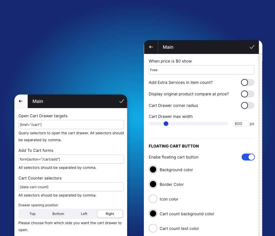
1. Cart Triggers & Theme Integration
Supercart connects seamlessly to your Shopify theme by capturing standard user actions:
Open Cart Selectors
This field defines which HTML elements or buttons on your store open the Supercart drawer when clicked.
- Default Selector:
[href="/cart"] - How it works: Any cart icon, header link, or navigation element pointing to
/cartautomatically intercepts the click and glides open the Supercart drawer instead of redirecting the shopper to a clunky full-page cart. - Custom Theme Selectors: If your theme uses custom classes (e.g.,
.header__cart-toggleor#cart-icon-bubble), you can add them separated by commas:[href="/cart"], .cart-toggle-btn, #cart-icon
Add To Cart Forms
Controls whether the drawer automatically opens when a customer clicks “Add to Cart” on product pages or quick-view modals.
- Enabled (Recommended): The drawer opens smoothly immediately after the product is added, confirming the addition and displaying upsell opportunities.
- Disabled: The item is added quietly in the background without opening the drawer until the shopper clicks the cart icon.
2. Drawer Layout & Sizing
Supercart gives you granular control over the drawer’s visual geometry:
Open Cart Position
Choose the direction from which the drawer enters the screen:
- Right (Default & Recommended): Standard e-commerce convention; highly natural for mobile thumb reach.
- Left: Popular for RTL languages or minimalist left-aligned store layouts.
- Top / Bottom: Slides down from header or up from bottom sheet on mobile devices.
Max Width
Controls the desktop width of the slide drawer:
- Default:
440px - Recommended Range:
400pxto500px - Pro Tip: If your store features rich product bundles or multi-variant upsell cards, widening the drawer to
480pxgives images and pricing badges more breathing room. On mobile devices, Supercart automatically scales to100vwfor a native app feel.
Cart Corner Radius (Rounded vs. Flat)
Match your brand’s aesthetic language:
- Flat (0px): Modern, sharp, luxury, and editorial typography aesthetics.
- Rounded (8px–20px): Soft, approachable, and playful modern DTC aesthetics.
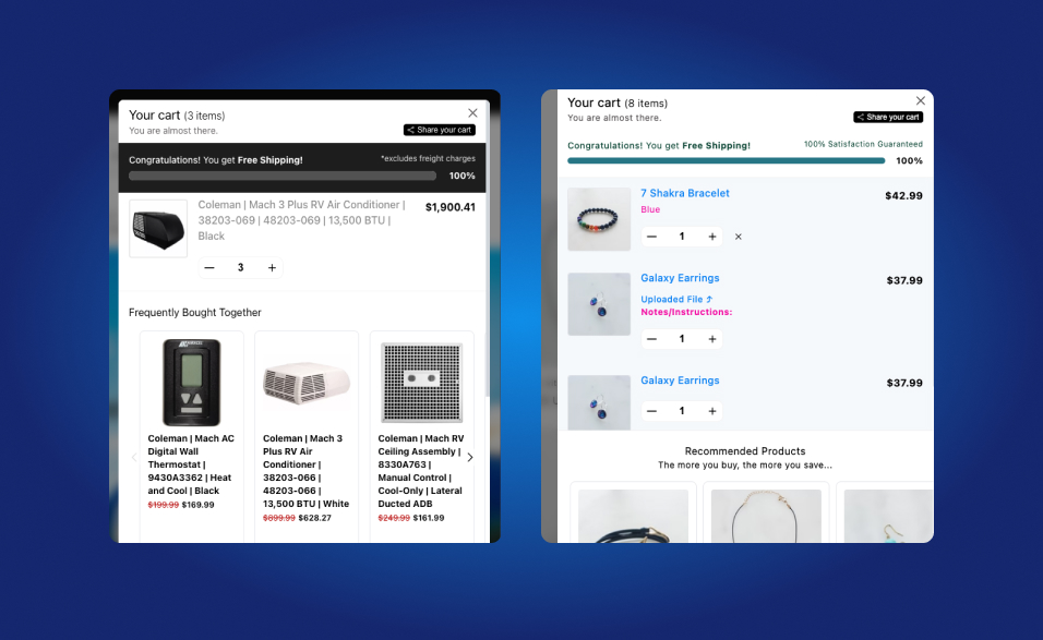
3. Floating Cart Bubble Widget
Supercart includes an optional Floating Cart Bubble that hovers in the bottom corner of your storefront:
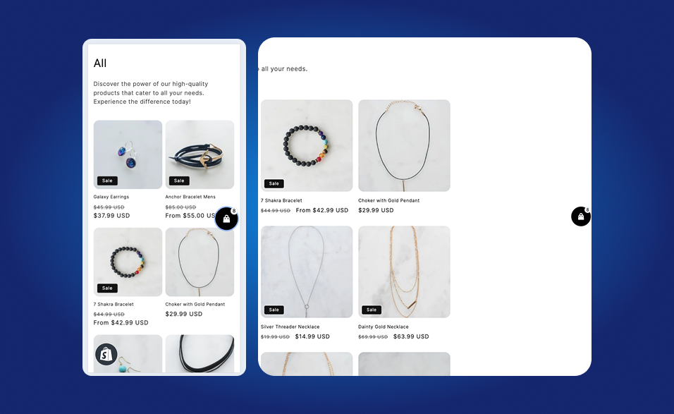
- Persistent Access: Shoppers can always view their cart count and access checkout, even if they have scrolled past your store’s main header.
- Positioning: Choose between bottom-right or bottom-left placement.
- Dynamic Badge: Displays real-time item count with subtle pulse animations upon new item additions.
- Toggle Off: If your store already has a sticky mobile bottom navigation bar or chat widget (like Gorgias or Klaviyo), you can easily disable the floating bubble to prevent visual overlap.
4. Shipping Rates Estimator
Supercart features a built-in shipping rate estimator block:
- Shoppers can select their country and postal code to preview exact real-time carrier shipping rates directly in the drawer.
- Eliminates “hidden shipping cost” surprise—the #1 driver of checkout bounce rates.